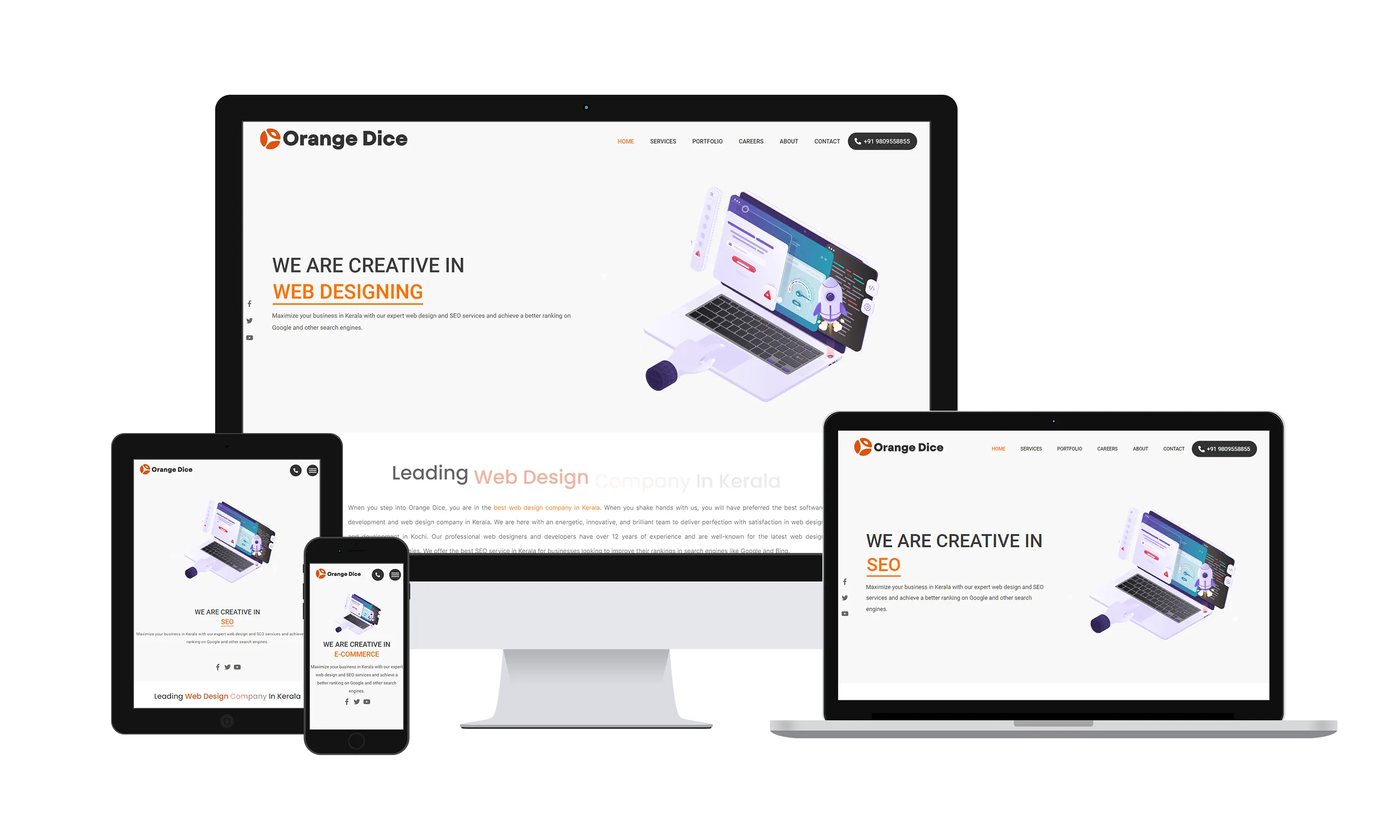
Businesses Must Design Responsive Web-Sites if They Want to Grow
RESPONSIVE DESIGN: INTERNET USAGE NOW COMES IN ALL SHAPES & SIZES: In August 2014, the CEO of Google predicted that India's Internet population would (at 250 million users), surpass the US in 2014. Indian users access the Internet using a bewildering array of gadgetry from antiquated school computers to the latest phones, tablets and fablets. Hence the need to retrofit old sites and build new sites that load quickly and cheaply using "responsive design."
Web sites designed before the smartphone era had it a lot easier as user expectations were lower, and smaller screen sizes or web access by phone were relatively rare. Today, companies are designing for web users with higher expectations and larger wallets. With many more screen sizes and operating systems than previously.

THE STAKES ARE GETTING BIGGER: With the Indian population approaching 1.3 billion, India's 250 million online users would mean an estimated online population of 19 percent and growing. Businesses that do not plan responsively designed web sites will pay dearly for their lack of preparedness.
DEMOGRAPHICS DRIVE THE TREND: Why are these online numbers so high? They are high because 50 percent of India's overall population is below the age of 25). These users are also frugal because they often have to pay for expensive Internet time on their phones. If your site does not load quickly and cheaply, your visitors will promptly leave without missing a beat.
India is expected to have 500 million of these demanding Internet users by the end of 2018
WHAT IS RESPONSIVE DESIGN Responsive web design easly outputs different designs for different devices without changing the url. Its simply done by different ways using CSS (Cascading Style Sheets) which allow us to specify various design instructions in "what if" scenarios. For example if screen height and length are within certain dimensions then the page is to be formatted in a particular way.
We can design a responsive website by using the width and height of each content block in percentages and change the positioning and alignment of these content blocks for smaller than typical devices (not by device detection, only by width and height). The web trends reports estimates that mobile screen sizes are increasing in every country and that India has the most mobile users with 6 inch plus mobile screens.
It took at least two decades for laptops to outnumber desktop computers, whereas the number of notepads will outnumber laptops in less than half that time.
LOW BAND WIDTH BENEFITS: Another good thing about responsive design is that it is very useful for websites which serve countries like India. In India internet speeds are often very slow. Also here, more users use smart phones with pocket data internet (not even 3G is common). So by using responsive design we can serve them simple and fast loading objects only.
SEARCH ENGINES: Responsive web sites do not lose out when it comes to search engines, as they now serve all types of hardware as well as browser connectivity.
Overall, responsive design places great emphasis on adaptability. This usually implies a reduced emphasis on heavy animation and high resolution graphics. Working this way also reduces load time for site visitors who could get impatient and go elsewhere if loading times are long.
Your web-site is your company's most effective ambassador because it's always available. If it cannot serve information to clients using new devices, you will be estranging your early adopter clients. This is the group of clients who are usually the most likely to spend money on new ideas.